In a noisy digital world where billions of ads compete for attention, AdUnbox emerged with a bold vision: to unbox the truth behind every creative, every spend, and every impression.
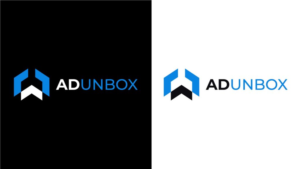
The logo tells this story visually—two angular wings guarding a rising arrow. It’s not just a box; it’s a launchpad. The black and white chevrons in the center represent the balance between complexity and clarity—what AdUnbox helps users master.
Whether in the shadows of black or the openness of white, the brand stands consistent—revealing, elevating, and innovating.

Symbol:
- A stylized geometric icon resembling an open box or an upward-pointing arrow.
- Composed of blue angular outer lines and a black-and-white chevron shape in the center.
- The symbol implies growth, innovation, and unveiling hidden value—key ideas for a data intelligence or ad tech platform.
Typography:
- The brand name ADUNBOX is split stylistically:
- “AD” in bold black (or white, depending on the background), representing advertising and solidity.
- “UNBOX” in sky blue, symbolizing uncovering, discovery, and clarity through data.
Color Contrast:
- Left side: logo on black background, showing power, tech-savviness, and elegance.
- Right side: logo on white background, emphasizing professionalism, minimalism, and openness.

