💡 About the Project
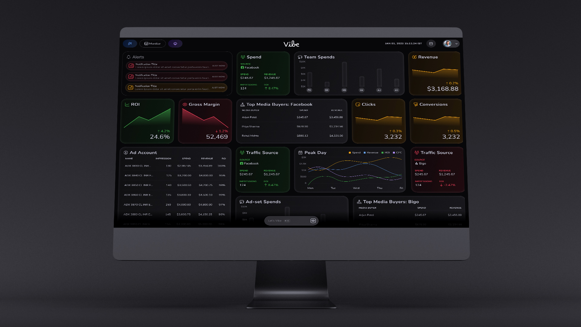
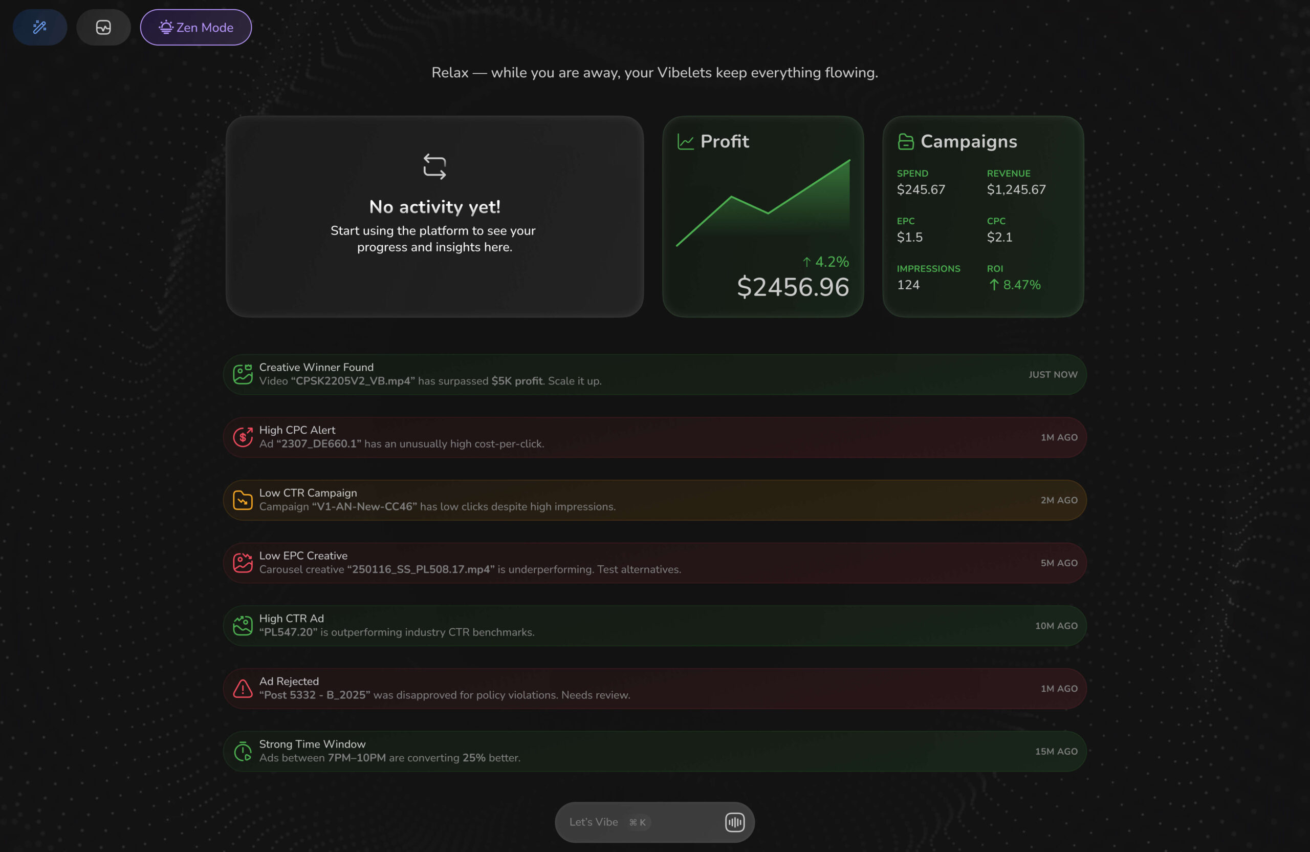
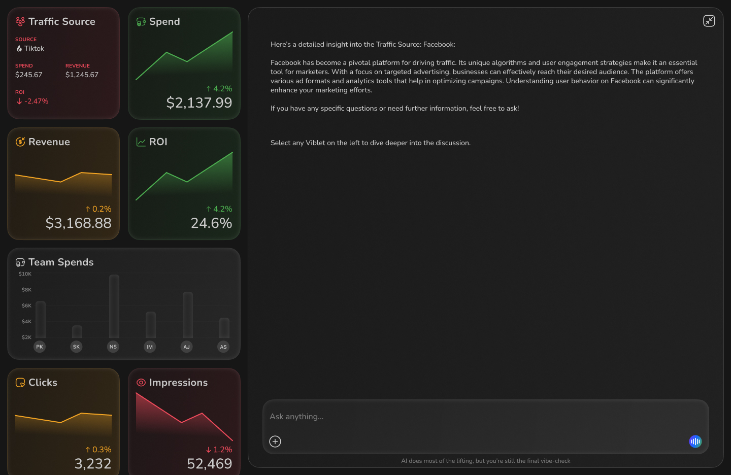
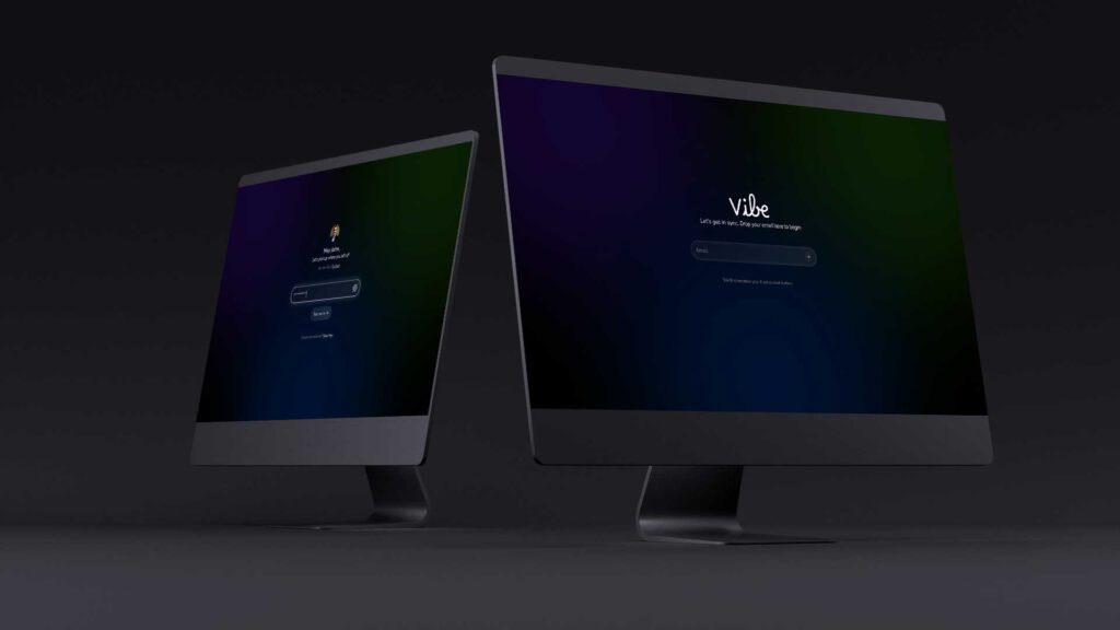
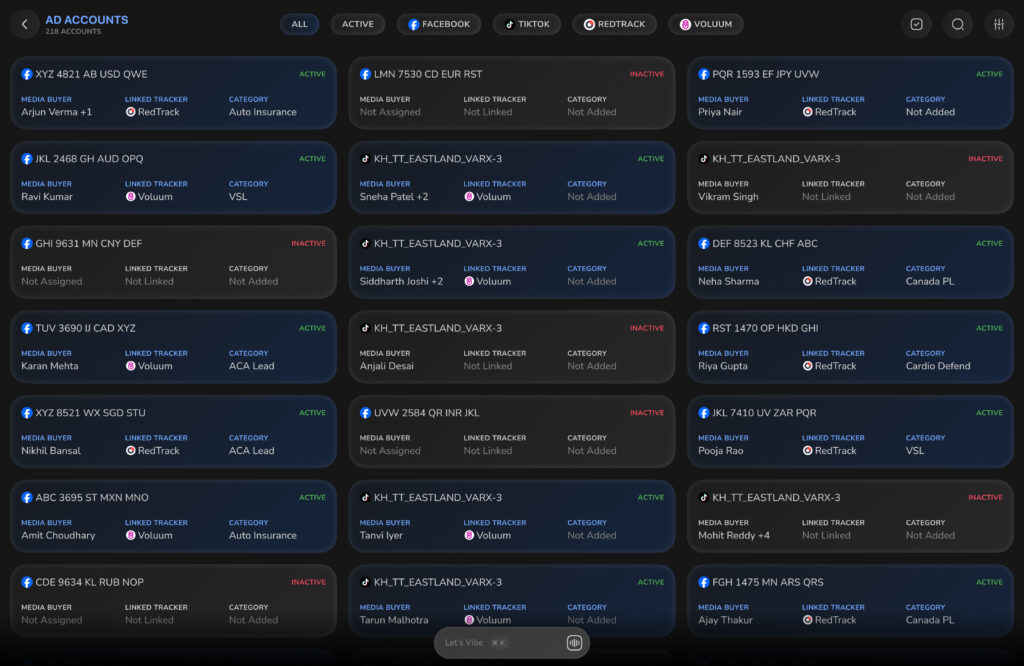
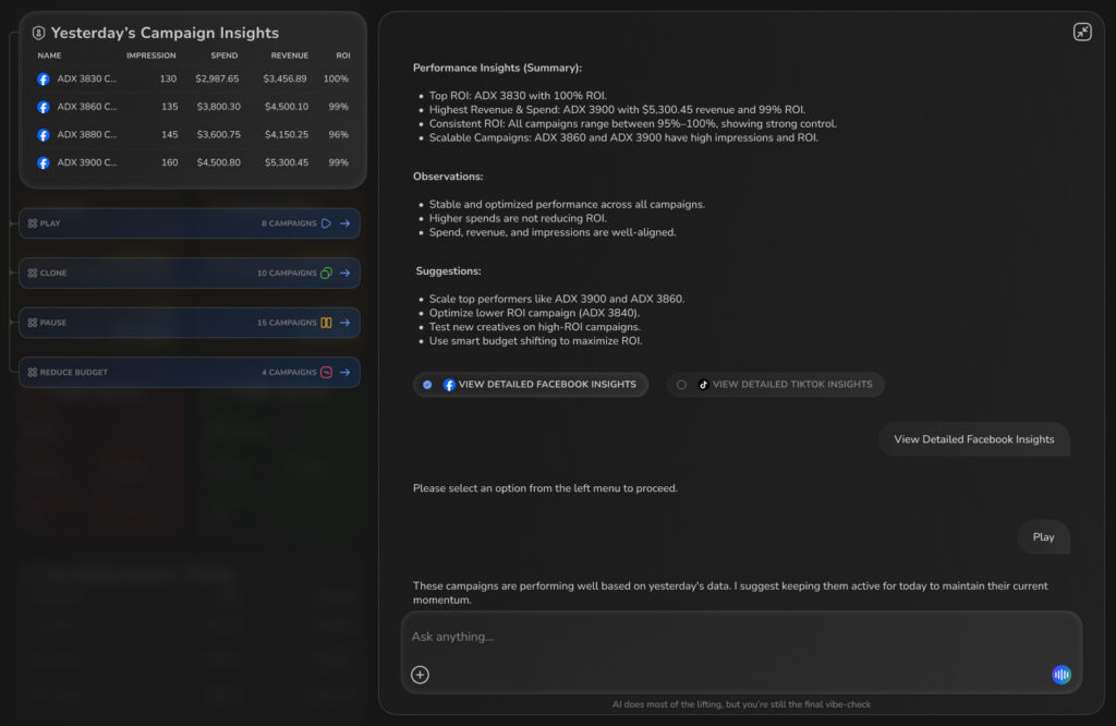
The Vibe Marketing Analytics Dashboard was designed to help marketing teams track campaign performance, spending, conversions, and return on investment (ROI) in real time. It consolidates multiple data sources (Facebook, TikTok, Bigo, etc.) into a single, visually rich interface.
⚠️ Problem Statement
Before this dashboard:
- Fragmented Data Sources: Teams used multiple tools (Facebook Ads Manager, Google Analytics, Excel sheets), which required manual merging of data.
- Lack of Real-time Insights: Campaign adjustments were delayed because reporting cycles were slow.
- Poor Visibility of ROI: Decision-makers couldn’t easily compare spending vs. revenue across channels.
- Overwhelming Data: Users struggled with information overload and inconsistent data presentation.
🎯 What We’re Solving
- Centralized Data View – A single source of truth for marketing performance.
- Real-time Performance Tracking – Live updates of spends, clicks, conversions, and ROI.
- Actionable Insights – Alerts and visual cues for campaigns that need attention.
- Intuitive UI – Easy-to-read charts, KPIs, and data cards.
🗓 Project Timeline
Phase | Duration | Activities |
|---|---|---|
Discovery & Research | 1.5 weeks | Stakeholder interviews, competitor benchmarking, data mapping |
Ideation & Wireframing | 2 weeks | Low-fidelity sketches, layout exploration, information hierarchy |
Visual Design | 2 weeks | High-fidelity mockups, color palette, typography, accessibility testing |
Development Handoff | 1 week | Creating design specs, developer collaboration |
Testing & Iteration | 1 week | Usability testing, data validation, design refinements |
Launch | Continuous | Monitor usage & feedback for improvements |
🎨 Design Pattern & Process
- Empathize – Understand user pain points.
- Define – Clarify the key metrics and interactions.
- Ideate – Explore layouts and data visualization approaches.
- Prototype – Build interactive prototypes.
- Test – Conduct usability and A/B testing.
- Implement – Work closely with developers for smooth integration.
🧠 Empathy Mapping
User Segments:
- Media Buyers – Want quick spend vs. revenue comparisons.
- Marketing Managers – Need an overall performance snapshot.
- Executives – Focus on ROI and trends over time.
Category | Details |
|---|---|
Says | “I need to know which campaign is underperforming immediately.” |
Thinks | “If I can spot trends early, I can save budget.” |
Feels | Frustrated when data is late or inconsistent. |
Does | Checks dashboard multiple times a day, downloads reports for meetings. |
📊 Quantitative Research
We analyzed 3 months of historical marketing data across 4 major platforms:
- Fragmented Data Sources: Teams used multiple tools (Facebook Ads Manager, Google Analytics, Excel sheets), which required manual merging of data.
- Lack of Real-time Insights: Campaign adjustments were delayed because reporting cycles were slow.
- Poor Visibility of ROI: Decision-makers couldn’t easily compare spending vs. revenue across channels.
- Overwhelming Data: Users struggled with information overload and inconsistent data presentation.
📊 User Personas
Persona 1 – Media Buyer
- Name: Arjun Patel
- Role: Digital Marketing Executive
- Goals: Optimize ad spend daily, identify top-performing ad sets quickly.
- Pain Points: Wasting time switching between platforms, missing early signs of poor performance.
Persona 2 – Marketing Manager
- Name: Priya Sharma
- Role: Marketing Manager
- Goals: Get a daily performance overview, plan strategy based on ROI.
- Pain Points: Hard to consolidate reports, struggles with identifying trends quickly.
Persona 3 – Senior Executive
- Name: Rahul Mehta
- Role: Head of Marketing
- Goals: Review overall marketing effectiveness, ensure campaigns are cost-efficient.
- Pain Points: Too much granular data, prefers high-level summaries.
👋 Thank you for exploring the Vibe App case study!
We hope you enjoyed the journey through its design and functionality.
If you have any thoughts, questions, or just want to say hello feel free to reach out!
